
Making Data Look Good
- Ethan Westerholm

- Mar 26, 2024
- 4 min read
Data Visualization for Dummies
Data visualization is a way to present data in the form of an appealing chart, diagram, or infographic. The point of data visualization is to quickly communicate information through an easy channel. Simply talking about raw data isn’t enough. Throwing numbers at an audience will cause them to check out quickly.
You can engage your audience and communicate a large amount of data through visuals. Although the artist inside you may feel trapped by these rules, good data visualization has the data in the foreground. If your audience can’t find your numbers or reasoning, then your diagram is more of a painting than a pie chart.
What Makes Good Visualization?
So how can you convey your information to your audience in an effective way? This is the true obstacle to tackle, and sadly there is no hard or fast answer. However, there are suggestions or guard rails that help us stay on track when we create appealing data visuals. These guard rails are common rules for graphic design that have been tweaked slightly to better fit the data side of things (1).
In honor of our dodo mascot, it is my pleasure to introduce the DEVIN system! For a graph to work properly it must be:
Distinctive
Entertaining
Valuable
Informative
Novel
Distinctive
Now what do we mean by distinctive? A good diagram is able to communicate its “big punchline” immediately upon first glance. The pitfall of many diagrams is that their creators try to push too much information onto a single image. A bad diagram can lead to confusion over the data, and can cause the audience to tune out all the important information you have to share!
There is a fine line between chaos and curation; be careful with how much your diagram is trying to say. Now there is a difference between distinctiveness and simplicity. You can have a very rich/complex diagram, however what makes it distinct is the easy-to-grasp message it is sending the viewer.
Ex. The 50 Most Visited Websites in the World (2).

Entertaining
We know that data can be boring, but it doesn’t have to be! We will not stop talking about how interesting data can be if you show it off correctly. A good graph makes data interesting to look at. You can do this multiple ways, however the best way to do this is to format your graph in a unique way!
Although pie charts, bar graphs, and the like are tried and tested; if the visual successfully communicates the idea you are telling then it works. Another part of what makes a graph entertaining is the subject matter itself. Some statistics are more difficult to make entertaining than others, so choosing what to show and what not to show can prove pivotal when making a good graph.
Ex. The Largest Vocabulary in Hip-Hop (3).

Valuable
Listen, data is a hard pill to swallow. You need to show to your audience why you need a chart. When you introduce data, you are on the defensive. You have to justify why you are bringing this piece of the pie up. Most of the time if you are spending enough effort in converting a data set into a diagram, then you know how important it is. Making a valuable graph means you put the important information in front of your audience’s eyes.
Ex. The Next America (4).

Informational
Ah, now we reach what I consider the hardest part of making a good diagram: the information. Your diagram can’t be just a pretty picture I am afraid. Each diagram must include the crucial details and data that allows room for exploration. A distinctive diagram lets the viewer absorb the big picture idea at a glance, while an informational diagram invites the viewer to dive deeper into the smaller details of the chart.
If your diagram is too simple and doesn’t have the strength to stand up to deeper scrutiny then it will struggle. Think of your graphs information as a reward for the people who choose to dig deeper into your diagram!
Ex. Six Ways to Find Value In Twitter’s Noise (5).

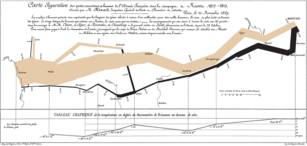
Novel
Novelty is a bit of a rare word: it is used to describe something new or unusual. This novelty characteristic is much more umbrella than the last four, and includes everything that separates your graph from others. We here at DataDodo believe that graphs are an opportunity to visualize data in a creative way, so all good graphs have that pinch of spice that makes it different.
This manifests in multiple ways, from unique shapes within the graph, to a fitting color scheme, or an organized form of data sharing that tells a story. A novel graph makes an audience member ooh and ahh when they realize what you are doing. Think of novelty as anti-mundane: something that shows your passion in the subject to your audience. Of the five characteristics, novelty is the hardest to put into practice.
If you are looking for how to make your graph more novel, think to yourself what a stranger to the field would think about your graph. Would they become confused or curious?
Ex. Charles Minard’s Map of Napoleon’s March (6).
Application for Journalists
Data visualization is more of an art than a science; mainly because it is mostly art and less science. As a journalist, you take large weighty concepts and large bundles of statistics and concentrate them down into digestible chunks. One of the best ways to do this is through an eye-catching visual. However, in our modern world of the internet graphs have a lot of competition.
Instead of spiraling into despair, we should use this as an opportunity to master the craft of storytelling and data analytics by making the best diagrams we can.
Sources
(1) - Data Visualizations, Charts, and Graphs, from Harvard University. https://accessibility.huit.harvard.edu/data-viz-charts-graphs, accessed 3/26/2024.
(2) - The 50 Most Visited Websites in the World, by Dorothy Neufeld. https://www.visualcapitalist.com/the-50-most-visited-websites-in-the-world/, accessed 3/25/2024.
(3) - The Largest Vocabulary in Hip-Hop, by Matt Daniels. https://pudding.cool/2017/02/vocabulary/index.html, accessed 3/25/2024.
(4) - The Next America, by Paul Taylor. https://www.pewresearch.org/social-trends/2014/04/10/next-america/, accessed 3/25/2024.
(5) - Six Ways to Find Value in Twitter’s Noise, by Scott Berinato. https://hbr.org/2010/06/vision-statement-six-ways-to-find-value-in-twitters-noise, accessed 3/26/2024.
(6) - Is Napoleon’s March the Greatest Statistical Graphic Ever? https://flowingdata.com/2008/07/17/is-minards-map-of-napoleons-march-the-greatest-statistical-graphic-ever/, accessed 3/26/2024.


Comments