
A Graph for Every Occasion
- Ethan Westerholm

- Mar 28, 2024
- 4 min read
Introduction
In our last blog post, we talked about data visualization: what it is, and how to make a good diagram. However, there are many journalists who approach data visualization differently than we do. If you recall our DEVIN system, one of the characteristics that make a graph good is V for valuable. If your graph is not adding to your point then you should not include it. However, out of all of our characteristics, a visual’s value is one of the most important, especially when you are faced with hundreds of different kinds of visuals. So today, we will go through and create a quick guide on what types of graphs you should use and when you should use them.
The Graph Bestiary
As you explore different articles in the wild, you will discover many different kinds of graphs in the wild. Perhaps it’s a weakness of mine, but I need categories to better understand the differences between things. So I curated a small list for us to analyze today.
This list includes line graphs, bar graphs, pie charts, and scatter plots (1).
Line Graphs
Good old faithful, there is no better friend to have than a line graph. Line graphs help inform your audience of directions and trends. There is a reason why television arrows and line graphs are shown. A line graph is an excellent way to communicate cause and effect. You should utilize a line graph when communicating change. Counter-intuitively, a line graph is quite boring if it's just a line. Only when serious variation needs to be communicated is when a line graph should be deployed.
DJIA History from 2017-2020 (Really communicates "that's not normal")

Bar Graphs
The vertical cousin of the linear classic, bar graphs often show up with line graphs for similar reasons. What makes the bar chart different than the line chart is that it is better equipped to show data changes across groups. While the line chart shows trends much better, the bar chart is better at communicating nuanced differences between sub-datasets (2). You sometimes see line charts trying to replicate the subtle perfection of a bar graph by jamming in multiple lines at the same time. Although this method can be effective in rare circumstances, the bar graph uncomplicates all of that with a sleek and timeless way to communicate group information.
Top 5 Artists With Most Billboard # 1s (Oh wow, look how close they are!)

Pie Charts
Have you ever felt the need to communicate data visually, while also being a tad bit snackish? Introducing the pie chart! I am sure that most of you are familiar with the pie chart, as I believe it is one of the more visually interesting graphs; but how do we use it? A pie chart is best used when communicating how individual data sets affect the whole. While line charts use individual data sets in a vacuum, and bar charts use grouped sets in tandem, pie charts give us a closer look at what makes up a group (3). We recommend you use a pie chart when the individual pieces of a data group have changed enough to change the group.
Melissa Wakefield's pie of pie flavors (4).

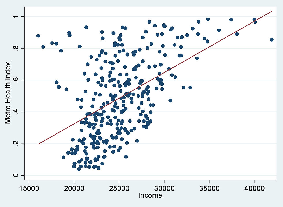
Scatter Plots
Finally, we reach the estranged uncle of the graph family, the scatter plots. Personally, of the four, scatter plots are the most difficult to use. There are many different times when someone uses a scatter plot when one of the other three would be more appropriate. However, that doesn't mean that the plot is useless, far from it. A scatter plot is the dark reflection of the bar chart. Where the bar chart compares multiple data groups against each other, a pictograph compares multiple data sets against each other.
Now this by itself can be done by a bar graph just as well (or even better). The strength of a scatter plot though is in how it can communicate trends like a line chart would. Do you now understand the mysterious aura that surrounds the scatter plot? It is Frankenstein's monster of the graph family, a strange amalgam of the other charts that will rarely see the light of day. Most of this is friendly graphic design jesting, but just be aware of the power you wield when you use a scatter plot in a journal article.
Example scatter plot from Minnesota Department of Health (5)
Summary
Now that we have ventured through the many alleys and detours of different graph types, let us clear our minds with a quick summary. Line charts are designed to share the direction of a data set. Bar graphs are designed to show the differences between similar data groups. Pie charts are designed to show how individual data sets affect a larger data group. Finally, scatter plots show the differences and directions of different data sets.
There is plenty of bleed in between these four categories, that's why they all belong to the same family. You can use a bar chart to show the information of a scatter plot or vice versa, however, you should not just throw any kind of graph at your audience. This leads us to our final point.
Application for Journalists
As a journalist, your first and primary objective is to communicate a story to your audience. Often in the world of journalism, you come across a lot of data that may seem uninteresting to your average Joe in number form but could prove crucial to your story.
Sadly there is no hard or fast rule that you can follow to guarantee the story is communicated to your audience. As we have said before in our previous posts, graphs, and data visualization is an art form that journalists can master over some time and with enough practice.
Sources
(1) - Coursera, https://www.coursera.org/articles/data-visualization, accessed 3/28/2024.
(2) - Mike Yi, https://www.atlassian.com/data/charts/bar-chart-complete-guide, accessed 3/28/2024.
(3) - Tableau, https://www.tableau.com/data-insights/reference-library/visual-analytics/charts/pie-charts, accessed 3/28/2024.
(4) - Eliza Barclay, https://www.npr.org/sections/thesalt/2014/04/08/300620654/this-pie-chart-is-delicious-and-statistically-sound, accessed 3/28/2024.
(5) - MN Department of Health, https://www.health.state.mn.us/communities/practice/resources/phqitoolbox/scatterplot.html, accessed 3/28/2024.


Comments